Cart 0

LOGO

OUR STORY

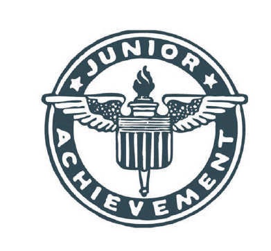
From the original Junior Achievement logos (launched in 1919 and 1941), which used wings as their visual symbol, came the idea of flying, excelling, having the means to soar. 

Yet our students do not stand alone, but impact those around them, sharing their newly acquired skillset and confident mindset. Just imagine if every JA student created jobs for just five others! Youth unemployment would soon be a thing of the past.

For this reason, we started with JA’s original soaring bird (from 1919 and 1941), and turned it into a flock of six (the JA student + five others impacted by that student). We then brought in similar lines and angles from the JA symbol that launched in 1967, reintroduced the kite logo (launched in 1955) via the negative (white) space of our new symbol, and kept a strong correlation with our longest-running symbol, launched in 1986.

JA’s brand symbol honors our long and impactful history while moving us into the future.


EVOLUTION OF THE JA SYMBOL


MODERNIZED JA SYMBOL


SYMBOL: FULL COLOR

The full-color symbol on a white background is a striking image. 

FIXED: Use this symbol only on white or on the colors shown on the next page. When overlapping other colors, use the colors other than white or the four shown on the next page, use the monochrome version in this section. Also see notes in the “Signage” section about the alignment of the points in the symbol.

Make this symbol your website favicon and your social-media profile picture (both ready for you as downloads).

FLEXIBLE: Temporarily replace your social-media profile pictures with event- or campaign-specific images, as desired, reverting back to this design at the end of the campaign.


SYMBOL: ADDITIONAL COLOR OPTIONS

Here are examples of the symbol placed on four primary colors; Boundless Blue, Resilient Turquoise, Yellow Inspiration and Immersive Blue-Black. 

FIXED: Use these symbol in only these combinations.  

When placing the symbol on any other color or image, use monochrome symbols shown on the following page.


SYMBOL: MONOCHROME

When our monochrome symbol, the right half of each bird remains a solid color, while the left side is 50% translucent, using the same color. 

FIXED: At least one of the colors must be from the primary color palette. The colors on one side of each bird should be only a 50% translucency. (We’ve consistently made the left sIde more transparent, but you may alter this to the right side, as needed.)

FLEXIBLE/FREESTYLE: The symbol can take any color from our color palette and go over any color from the color palette, as long as there’s enough contrast, and as long as the one-color-from-the-primary-color-palette requirement is met, above.

When the symbol is used as part of a design, the birds can take on multiple colors. See the “Collateral” section for examples.
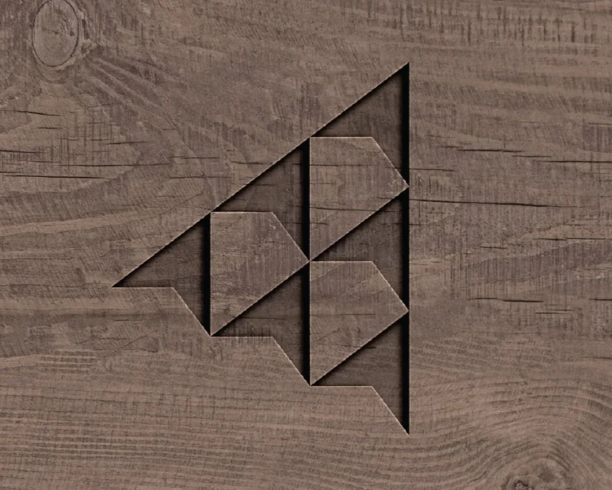

ONE-COLOR SYMBOL

When the symbol needs to be etched, engraved, or screen-printed, or in any other cases when the full color or monochrome symbol can’t be used, use this etching. 

FIXED: Except when etched or engraved (which is a colorless process), this symbol must be used over one of colors in the primary color palette.
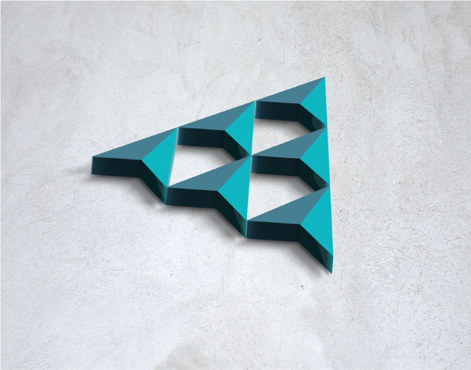
SYMBOL AS ART

This design can be used to create 3D sculptures or art to decorate a space. It may also be used as a graphic element.
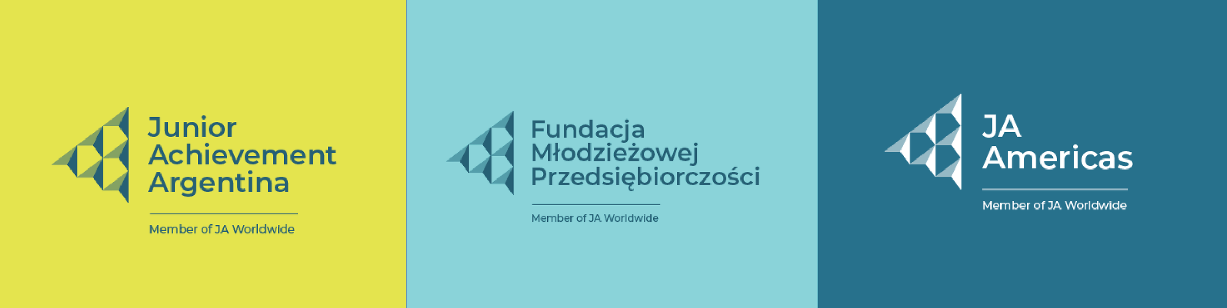
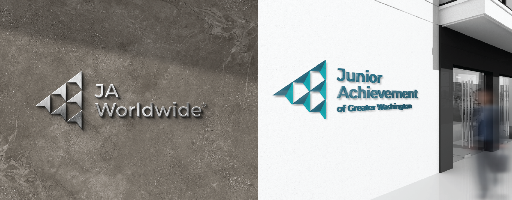
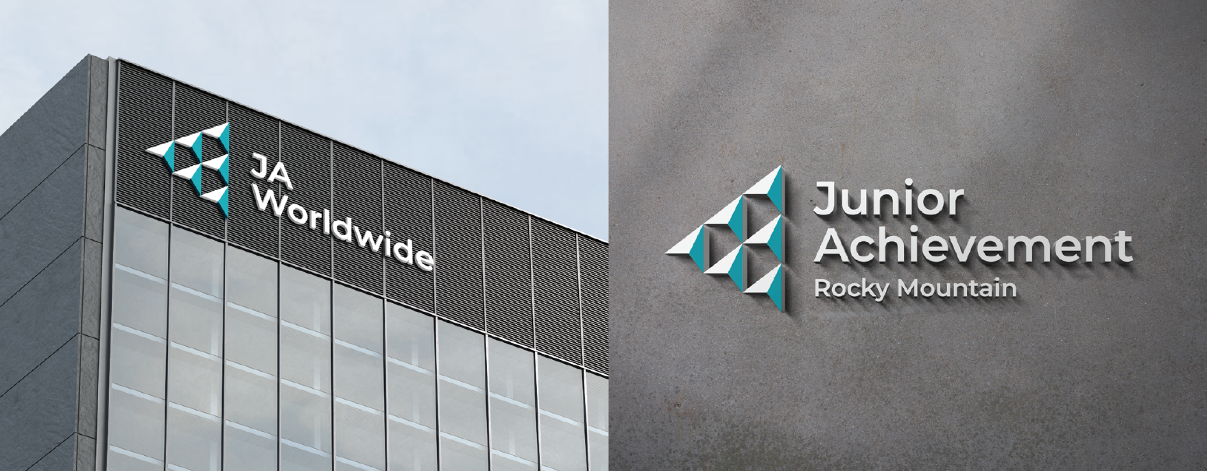
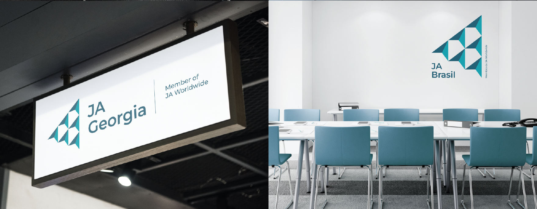

FULL-COLOR LOCKUPS

Our global symbol, combined with the name of each organization (and, for regional operating centers and member locations, “A Member of JA Worldwide”), creates a consistent global identity. 

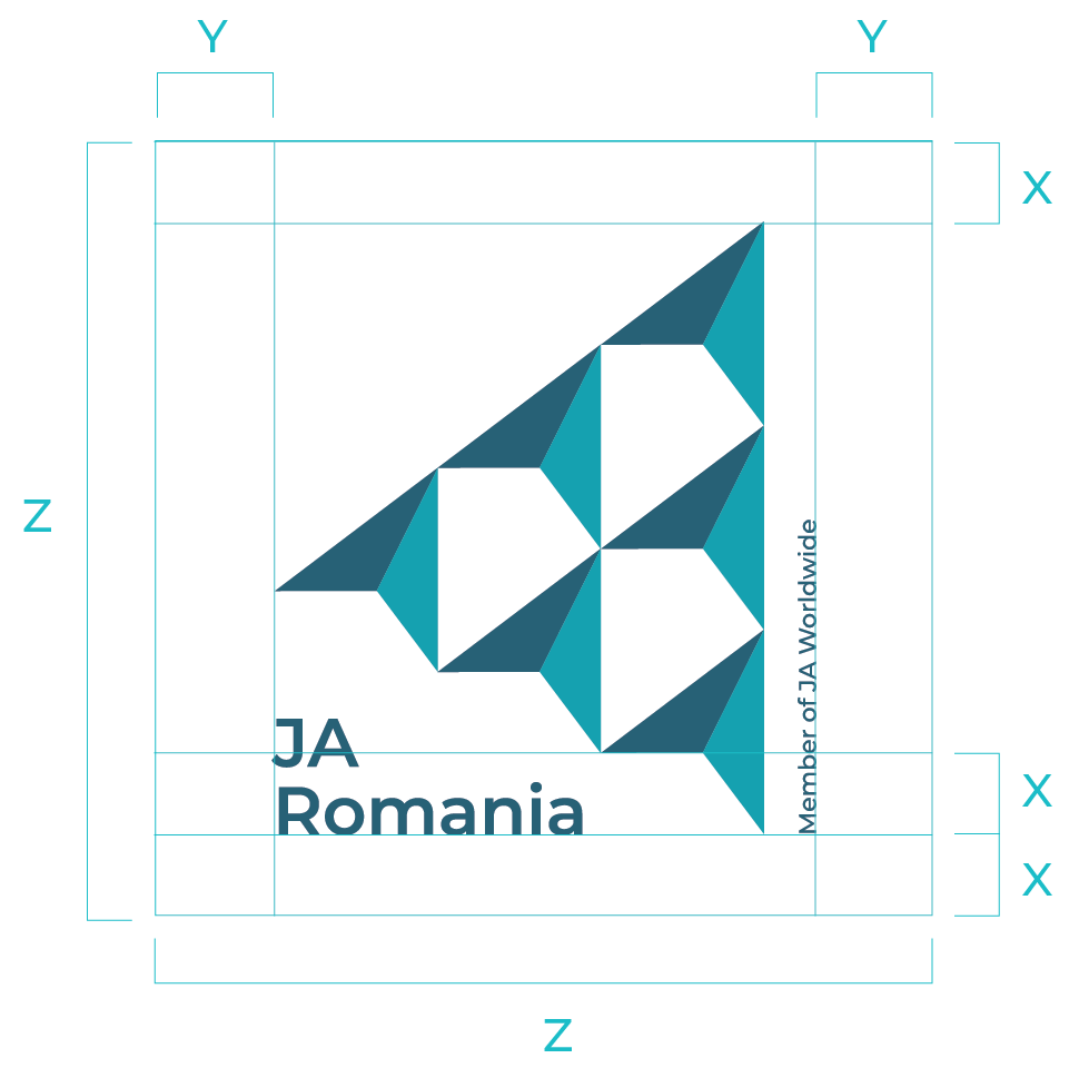
FIXED: These lockups have been created for you and is fixed. The version shown here is for a white background. Also see note in the “Signage” section about the alignment of the points in the symbol.

FLEXIBLE/FREESTYLE: Monochrome versions of the lockup can overlay any of our 16 colors, as long as one of the colors is from our primary palette. 
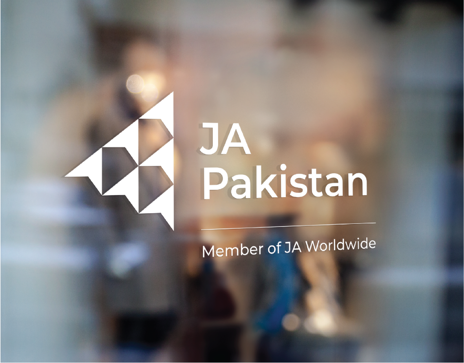

MONOCHROME LOCKUPS

When the symbol becomes monochrome, the right half of each bird remains a solid color, while the left side becomes 50% translucent with the same color. 

FIXED: At least one of the two colors must be from the primary color palette.

FLEXIBLE/FREESTYLE: The symbol can take any color from our color palette and go over any color from the color palette, as long as there’s enough contrast, and as long as the fixed requirement is met, above.


SIGNAGE

INTRODUCTION

Signage is a vital part of brand identity, both internal and external. Some JA locations own large buildings that require equally large signage. Others are located in small workspaces that will require only a sticker on a door. Still other offices are fulltime work-from home. No matter what your circumstance, you’ll find advice and examples in this section. 

NOTE: We made a mistake early in the rebranding process: The symbol that has been used in the lockups and in most of the examples is not perfectly aligned when used at 500% and above. This means that, when the symbol is quite large (as on signage), the points will not align. Thanks to Junior Achievement USA locations that recognized (and fixed) this, you can download a perfectly aligned symbol to use in signage. Over the coming months, we’ll replace all instances of the symbol with the perfectly aligned one, but this temporary fix will work for now.


LIGHTBOXES AND PANELS

There are two predominant shapes of the JA signage: square and rectanglular. Square shape should hold the square lockups and rectangular shape should hold the elongated lockups. Signs may be backlit lightboxes, digital screens, or panels of varied materials (plywood, wood, plastic etc.)

Square Shape

Rectangular Shape, Long

Rectangular Shape, Short


LIGHTBOX/PANEL STRUCTURE

FIXED: While the size of the panel may vary, free space around the lockup is fixed. In cases of rectangular formats the free space equals the height of one bird. For a square format, top and bottom space equals X and left and right spaces equal Y: see the example shown below.

White panels go well with the light colors of the facades; blue panels go better with the dark colors of the architecture.


GLASS APPLICATION: FULL COLOR

Whenever possible, use full color lockups when applying signage onto glass.

GLASS APPLICATION: ONE COLOR

When it’s not possible to use the full color lockup application, consider this design in white.

SYMBOL ON ITS OWN

In some cases the JA symbol can be used on its own. It can be made out of the number of materials such as plastic, powder-coated wood or metal.


FRET CUT DESIGN

Fret cut signage design looks best in cases of JA Worldwide, Junior Achievement USA local areas and districts, and some other subnationals (that is, lockups that don’t include “Member of JA Worldwide” ). Fret cut designs may be presented in color or polished metal. 

FIXED:  When full color signage is applied to a gray or dark surface, use the Startup White and Resilient Turquoise lockup. When applied to the white surface, use the Boundless Blue and Resilient Turquoise lockup.


INTERIOR SIGNAGE

Here are few examples of interior signage used boldly on dividing walls, meeting room door, and on panels.

SYMBOL ON ITS OWN

In some cases the JA symbol can be used on its own. It can be made out of the number of materials such as plastic, powder-coated wood or metal.


SYMBOL: MATERIAL INSTEAD OF COLOR

The JA symbol may also be carved out of wood, fretcut out of metal, or molded into stone or concrete.

Stone Engraving

Metal Fretcut

Wooden Cutout

Wood Carving


SYMBOL AS ART

JA symbol can be converted into a piece of art to decorate an office space or space in front of JA building. It may be constructed out of wood or metal or any other durable material.


ARCHITECTURAL PATTERN

In some cases, where additional branding of the architecture is desired, a metal patterned skin can be applied to a facade. The pattern may be used to decorate the interior. In this case, it’s applied to a wooden surface to add texture.


COLOR: UPDATED IN 2023

PRIMARY PALETTE

BOUNDLESS BLUE
CMYK 92, 53, 39, 16
RGB 40, 95, 116
HEX #285F74
PANTONE 7707 C

RESILIENT TURQUOISE
CMYK 89, 11, 31, 0
RGB 0, 160, 175
HEX #00A0AF
PANTONE 7710 C

GRITTY GREEN
CMYK 34, 0, 99, 0
RGB 187, 209, 83
HEX #BBD153
PANTONE 382 C

EMPOWERED YELLOW 
CMYK 15, 0, 99, 0
RGB 227, 226, 79
HEX #E3E24F
PANTONE 388 C

OPTIMISTIC ICE
CMYK 25, 0, 8, 0
RGB 195, 237, 239
HEX #C3EDEF
PANTONE 628 C

IMMERSIVE BLUE-BLACK
CMYK 91, 64, 51, 40
RGB 34, 64, 77
HEX #22404D
PANTONE 7477 C

Our primary colors are the cornerstone of our brand identity. Empowered Yellow makes an exceptional highlight color, while Immersive Blue-Black is an excellent replacement for Black or Charcoal as your main font color.

Note: While fewer than 2,000 Pantone colors exist, there are over 11 million colors available in RGB/HEX, so consider the Pantone colors shown here a close substitute for our brand colors. Also, never use Pantone colors in Canva! 

FIXED: One of the six primary colors should play a dominate role in any design you create. 


SECONDARY PALETTE

Ten secondary colors round out our brand color palette.

OFF-WHITE
CMYK 5, 2, 2, 0
RGB 238, 243, 244
HEX #EEF3F4
PANTONE N/A

PALE YELLOW
CMYK 5, 2, 40, 0
RGB 243, 242, 179
HEX #F3F2B3
PANTONE 0131 C

PALE BLUE
CMYK 43, 0, 15, 0
RGB 153, 217, 223
HEX #99D9DF
PANTONE 3105 C

KEY LIME
CMYK 55, 0, 100, 0
RGB 143, 196, 64
HEX #8FC440
PANTONE 368 C

AQUA
CMYK 81, 0, 27, 0
RGB 0, 192, 202
HEX #00C0CA
PANTONE 7466 C

JADE
CMYK 85, 0, 70, 0
RGB 70, 177, 123
HEX #46B17B
PANTONE 7480 C

TEAL BLUE
CMYK 93, 25, 35, 1
RGB 0, 139, 156
HEX #008B9C
PANTONE 7711 C

GRASS GREEN
CMYK 96, 10, 100, 2
RGB 0, 148, 36
HEX #009424
PANTONE 7482 C

CERULEAN
CMYK 91, 45, 32, 6
RGB 40, 112, 139
HEX #28708B
PANTONE 7468 C

FOREST GREEN
CMYK 90, 29, 99, 17
RGB 0, 118, 61
HEX #00763D
PANTONE 7726 C


Use secondary colors in conjunction with at least one of the six primary colors. At least one primary color should always play a dominate role in your designs.

When a design consists of many pages, slides, or frames (such as reports, PowerPoints, websites, videos), the rule above can be ignored, as long as the front cover, home page, beginning bumper and text utilize the primary palette. 

Also, review the “Accessibility” section of these guidelines before adding text to your images.


GRADIENTS

Gradients add variety to your designs while reinforcing our global identity. Five are shown here, but by combining primary and secondary colors, you can create 240 two-color gradients and even more three- or four-color gradients!

RESILIENT TURQUOISE–EMPOWERED YELLOW

GRITTY GREEN–PALE BLUE

BOUNDLESS BLUE–EMPOWERED YELLOW

IMMERSIVE BLACK BLUE–RESILIENT TURQUOISE

TEAL BLUE–OPTIMISTIC ICE

FLEXIBLE/FREESTYLE: Make your own two-color or three-color gradients from any of the 16 colors of our color palette. 

Note: Gradients made entirely from secondary colors should play a minor/background role in your designs. But as with the entire secondary color palette, when a design consists of many pages/slides/frames, this rule can be ignored, as long as the front cover, home page, beginning bumper, and text utilize the primary palette.


COMBINATIONS

Unsure how to combine primary and secondary colors? Here are some color combinations to get your started.

Familiarize yourself with the “Accessibility” section of these guidelines before adding text to any color. 

FIXED: Remember that at least one of the six colors in our primary color palette must be present in your designs.

OPTIMISTIC ICE, AQUA, EMPOWERED YELLOW, OFF-WHITE

AQUA, EMPOWERED YELLOW, OPTIMISTIC ICE, OFF-WHITE

PALE YELLOW, IMMERSIVE BLUE-BLACK, EMPOWERED YELLOW, OFF-WHITE

GRITTY GREEN, IMMERSIVE BLUE-BLACK, AQUA, OFF-WHITE

TEAL BLUE, EMPOWERED YELLOW, OFF-WHITE, OPTIMISTIC ICE

BOUNDLESS BLUE, GRITTY GREEN, OPTIMISTIC ICE, OFF-WHITE

JADE, GRITTY GREEN, AQUA, OPTIMISTIC ICE

OPTIMISTIC ICE, PALE BLUE, GRITTY GREEN, OFF-WHITE

PALE BLUE, CERULEAN, IMMERSIVE BLUE-BLACK, OPTIMISTIC ICE

RESILIENT TURQUOISE, OPTIMISTIC ICE, BOUNDLESS BLUE, EMPOWERED YELLOW

GRITTY GREEN, CERULEAN, IMMERSIVE BLUE-BLACK, AQUA

FOREST GREEN, OFF-WHITE, OPTIMISTIC ICE, IMMERSIVE BLUE-BLACK

CERULEAN, OPTIMISTIC ICE, IMMERSIVE BLUE-BLACK, OFF-WHITE

IMMERSIVE BLUE-BLACK, AQUA, TEAL BLUE, OPTIMISTIC ICE

GRASS GREEN, GRITTY GREEN, PALE BLUE, OFF-WHITE

OFF-WHITE, IMMERSIVE BLUE-BLACK, RESILIENT TURQUOISE, OPTIMISTIC ICE


CHARTS

Showing results or statistics in a chart? To reinforce our brand identity, use brand colors when you do so, even if Excel wants you to use a standard pastel-colored chart! 

FIXED: You do not have to use colors in the order shown here, but you must always use at least one non-white color from the primary color palette in your charts.

FLEXIBLE/FREESTYLE: Column charts are best used to show change over time (percentage variation), compare different categories, or compare parts of a whole.

Pie charts are best used for making part-to-whole comparisons with discrete or continuous data and a small dataset.

Column charts using one, two, three, four, five, and six color groups.

Stacked charts using two, three, four, five, and six color groups.

Pie charts using two, three, four, five, and six color groups.

Semicircle charts using two, three, four, five, and six color groups.


ACCESSIBILITY

An accessible website, online presentation, or live event is one that can be accessed by all visitors, taking into account their differing capabilities. Inaccessible content poses significant barriers to people with disabilities.

Besides alienating students, alumni, volunteers, partners, funders, and donors, inaccessible content may result in a fine—or even a lawsuit—in some localities.

A FEW BASICS

Designing for accessibility can be best summed up through the four areas shown below.

COLOR CONTRAST

Color contrast (scroll below for details) is the difference in brightness between foreground colors (say, the color of text or a button) and background  colors. “High contrast” (lots of difference in brightness) ensures that people with moderately low vision can distinguish between the colors and see your content. “Low contrast” means that the difference in brightness is quite low; that is, the colors are too much alike, are not easily viewed by someone with vision impairment, and leads to inaccessible content. 

CROWDING/OVERLAPPING

Including plenty of “white space” (the area of a design that does not have images or text) is a tenant of good design, but it is especially important when designing for accessibility. Be sure to allow plenty of blank space around text, images, buttons, and more, especially on mobile and other small devices. Avoid having your text overlap with other text. This is especially important when using our brand textures and patterns. 

ALT TEXT

When you upload an image or graphic to a digital space (website, social media, etc), you’re often given the option to describe that image or graphic in words as “alt text.” In this way, visually impaired users can still understand that a photo shows, for example, “JA student chatting with the CEO of XYZ Corporation while in a meeting with other XYZ executives.”

It’s really that simple: You describe the photo or image in words. It takes a bit of extra time but ensures that your photos are accessible.

ILLEGIBLE TEXT

Text tends to be illegible (that is, not readlabe) for two reasons: Because it is too small, and because the font itself is so fancy that it becomes unreadable. Stick to basic fonts like Montserrat and Work Sans on your website, and be sure they are at least 14pt (when bold) or 18pt (when not bold). 

Very large text can be as difficult to read as small text, especially if the large text is hyphenated at odd places. Hyphenate sparingly and only between syllables.

COLOR CONTRAST

Use this guide to ensure that your graphics and images are accessible to people with vision impairment, Accessible designs feature a great deal of contrast between font/button/icon colors and background colors.

In the chart below, rectangles represent background colors, while circles represent text/button/icon colors that sit on top of that background color:

If a circle is blank, that color works well on the background color shown. 

If you see an asterisk, the combination works only when the font is quite large (18pt or larger) or both bold and large (14pt or larger)

When you see an X, do not use this combination of text and background color.colors.